Vivo X70 Pro+ review: a well-oiled machine
After what seems like an eternity, the Apple-Samsung duopoly in the premium smartphone segment has finally run out and nowadays, buyers longing for a do-everything flagship will be spoiled for choices. Take Vivo’s X70 Pro+, for instance, which brings a fashionable design and a unique gimbal camera system to the mix. What’s more, the handset is the first Snapdragon 888+ flagship in the country and the device even improves upon its predecessor by roping in features like an IP rating, as well as wireless charging. Rest assured, the X70 Pro+ checks all the right boxes, at least on paper.
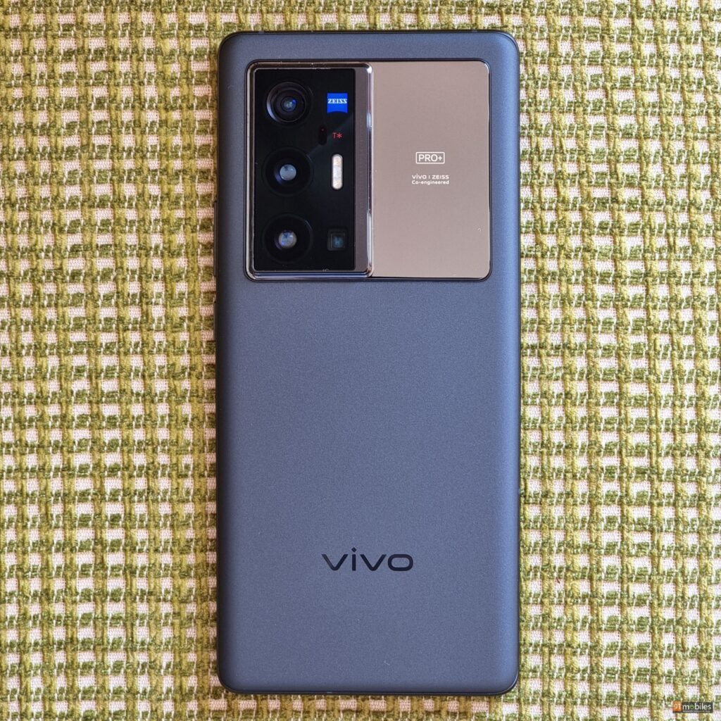
However, as is the case with any top-buck flagship, a premium smartphone’s inadequacies – as minute as they may be – are highlighted front and centre. After all, you wouldn’t want to pay upwards of Rs 70K for a phone, only to find it lacking in any area, amirite? So then, does the X70 Pro+ warrant a purchase? Or does it fall short to impress amidst the growing competition? Let’s find out in this review.
Verdict
Vivo has knocked the ball out of the park with the X70 Pro+. The handset isn’t perfect and I do have some pet peeves with the device. But, for the most part, the X70 Pro+ projects a premium user experience that’s rivalled by only a handful of phones… scoring high on almost all aspects in keeping with its flagship positioning.
Design
Vivo has spared no expense in the design of the X70 Pro+. Now, granted, the handset doesn’t feature its predecessor’s upmarket vegan leather finish, but that doesn’t take anything away from its good looks. On the contrary, the smartphone’s frosted glass back imparts a velvety texture that feels remarkable in the hand. Moreover, even though the smartphone has a good heft to it, the weight has been evenly distributed across the unit’s chassis. So, unlike the Mi 11 Ultra (review), the X70 Pro+ doesn’t feel top-heavy – at least, not to the same degree.
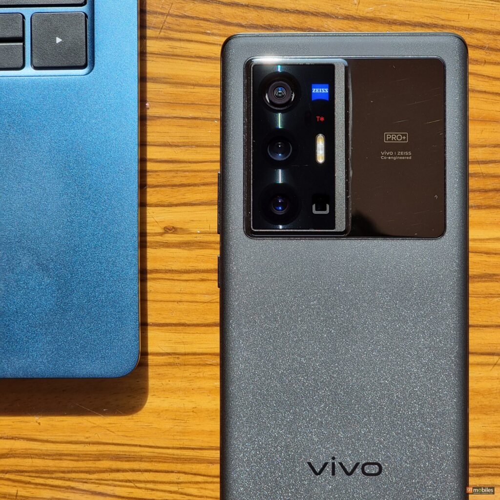
Interestingly enough, the back of the phone touts a rather large camera array. To maintain symmetry, the company has complemented the protruding camera bump with Zeiss branding, which extends towards the top right-hand side of the unit. What’s more, the entire camera module – including the bits with vivo and Zeiss’ logo – features a different, glossy finish. Consequently, you could use the reflective surface to snap selfies from the rear-facing cameras too. Of course, the company could’ve slapped on a secondary display, the likes of which you might’ve seen on the Mi 11 Ultra. However, that would’ve undoubtedly aggravated the handset’s ergonomics, so you win some and you lose some here.
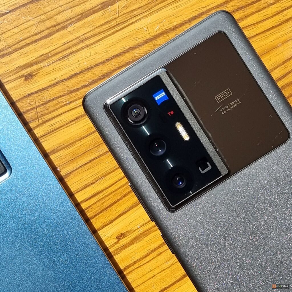
I really liked the design of the Vivo X60 Pro+, but my biggest pet peeves with the handset were the lack of any IP rating and wireless charging. Thankfully, Vivo has made amends with the X70 Pro+, which doesn’t just ship with IP68 certification, but even offers 50W wireless charging. Unfortunately, the smartphone doesn’t ship with a headphone jack, which is a bummer. However, the device somewhat makes up for it by bundling a pair of Type-C earphones in the box. Speaking of which, I’m convinced Vivo offers the most premium unboxing experience with its high-end offerings. The retail packaging for the X70 Pro Plus, for instance, features a tastefully designed case that mimics the engravings on the back of the phone, a pair of Type-C earbuds, a fast charger, and a Type-A to Type-C cable – talk about a complete package (pun intended).
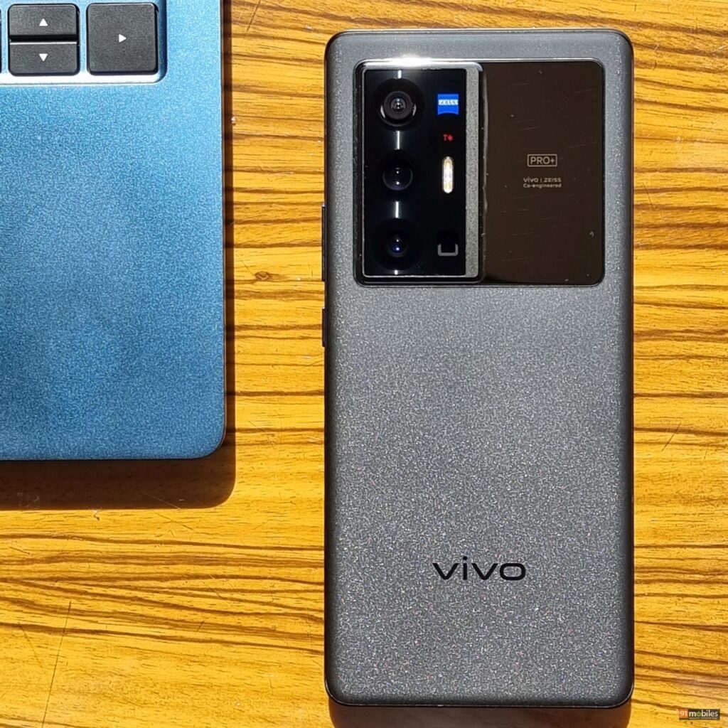
For anyone curious, the X70 Pro+ doesn’t ship with a notification LED. However, the device does offer an Always-On display, as well as ambient lighting that lights up the edges of the screen whenever you receive notifications. Moving on, the smartphone features an in-display fingerprint sensor which works well, albeit the positioning leaves something to be desired. Thankfully, the smartphone’s facial recognition tech is among the best in the biz. What’s more, you can “wake” the display by lifting the phone, which automatically triggers facial recognition and unlocks the phone in one seamless motion.
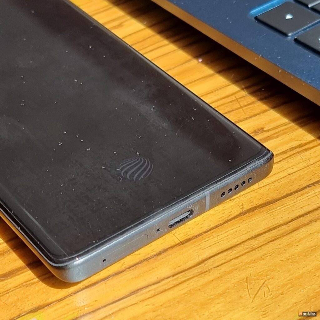
Unfortunately, the smartphone’s haptics weren’t to my liking. In fact, I found the tactile feedback too mushy and consequently, didn’t enjoy typing on the phone all that much. On the bright side, the device comes with a built-in IR blaster that allows users to control a slew of electronics via the phone’s Smart Control app.
Display and Audio
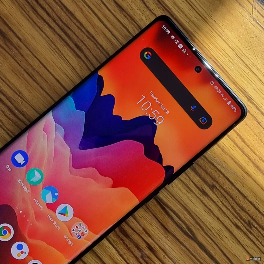
The Vivo X70 Pro Plus offers a ginormous 6.67-inch curved panel that checks most, if not all of the right boxes. For one, the screen is sufficiently pixel-dense and touts a WQHD+ resolution. Moreover, this being a 10-bit E5 AMOLED panel, the display offers deep, dark blacks along with ample contrast, stellar viewing angles and punchy colours. Add to that the screen’s 120Hz refresh rate and its 1,500 nits peak brightness and you’ll find little to complain about the X70 Pro Plus’ panel.
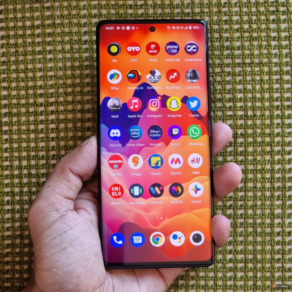
Now, I’ll be the first to admit that I’m not the biggest proponent of curved display phones. While the swooping curves do add to a handset’s aesthetics, they usually come at the cost of shoddy palm rejection. The X70 Pro+ is no exception and you’ll often find yourself triggering arbitrary functions when gripping the phone. Of course, if you can look past the accidental touches, then you’ll find plenty to like about the X70 Pro+ screen. In fact, the panel can relay media in HDR too, allowing buyers to make the most of high-definition streams from services like Netflix. Furthermore, the screen’s accommodating size and its 300Hz touch sampling rate makes it a godsend for mobile gamers – so much so, the handset picked up on all my on-screen commands in a jiffy and my fingers never had to fight for space whilst gaming on the phone.
Thankfully, unlike its predecessor, the X70 Pro+ touts a dual-speaker setup. The speakers on offer get quite loud and don’t crackle at high volume levels either. Rest assured, the X70 Pro+ will take your media consumption experience to the next level.
Cameras
Vivo’s X-series of phones are known to ship with industry-leading cameras and the X70 Pro+ is no different. The handset builds upon the company’s unique gimbal system and offers a 48MP Ultra-Sensing gimbal main camera. What’s more, the device features a 50MP GN1 wide-angle sensor, along with a 12MP ultra wide-angle sensor and an 8MP telephoto lens. For selfies, the device gets a 32MP selfie shooter up front.

So, are the cameras on the X70 Pro+ any good? More importantly, how does the smartphone stack up against other top-tier camera phones? Well, while I haven’t been able to compare the smartphone’s camera stack to every flagship thoroughly, but I do have some insights to share with you.


Let’s start with a comparison shot between the Samsung Galaxy S21 Ultra (review) and the Vivo X70 Pro+. Now, right off the bat, you’ll notice that Vivo’s offering doesn’t riddle the composition with punchy colours. Be it the sky, or the colour of the leaves, the photo captured by the X70 Pro+ exhibits much more realistic colours. Interestingly enough, while both images seem neck and neck at first glance, the photo shot using the X70 Pro+ yields slightly better sharpness, which is evident if you zoom into the school’s logo in the background.


Turn the page over to low light and the X70 Pro+ solidifies its lead tenfold. To that note, if you look at the comparison slider attached above, then the lowlight shot from the X70 Pro+ is more detailed and has little to no lens flaring, which can be accredited to the handset’s Zeiss T* coating that keeps unnecessary glares at bay. On the flip side, while the S21 Ultra also retains a good amount of details, the handset doesn’t resolve the light sources in the frame as eloquently.


With that said, the Galaxy S21 Ultra is still – at least in my books – the undisputed zoom king. In fact, the handset’s 5x hybrid zoom photos outclass the X70 Pro Plus’ 5x optically zoomed shots. As an example, in the comparison slider attached above, you can tell that the buildings in the background have much better details and textures on the S21 Ultra’s photo.
Alright, let’s switch things up and take a look at yet another compelling camera phone in the form of the Mi 11 Ultra. Now, I recently reviewed the phone and concluded that the handset’s main sensor is a notch above what you’d get with the S21 Ultra. In fact, I was pleasantly surprised by the sensor details in the Mi 11 Ultra’s photos. As an added bonus, the handset also managed to capture more realistic images. So, how does it fare against the newly launched X70 Pro+?


To answer that, I’d like you to pay close attention to the comparison slider attached above. Here, you’ll notice that both the photos exhibit similar colours, but the Mi 11 Ultra’s shot sways in favour of slightly warmer tones. On the flip side, the shot from the X70 Pro+ is very close to the actual scene, so Vivo takes the lead here. However, upon zooming in, the Mi 11 Ultra’s shot exhibits much sharper textures around the edges of the building, as well as the trees. So, between the two photos, I am more enamoured by the Mi 11 Ultra’s shot.


Furthermore, the Mi 11 Ultra tackles the shadows and the highlights in the frame relatively better too. Take this shot of the red flower for instance wherein, the X70 Pro Plus’ sensor has darkened the scene quite a bit. On the flip side, the Mi 11 Ultra’s photo has managed to squeeze every ounce of information from the shadows without overexposing the sky, which is fantastic.


Rounding off the camera comparison, let’s take a look at how the X70 Pro+ fares vis à vis the iPhone 12 Pro Max (review). Interestingly, there’s very little that separates shots from the Vivo X70 Pro+ from the ones taken with the iPhone 12 Pro Max. In fact, if you glance at the comparison slider above, then you’ll observe that the images offer similar hues in the frame. What’s more, the duo’s dynamic range is on par with one another too. However, at a closer crop, the pixel-binned photo from the X70 Pro+ edges out in front and offers sharper details across the frame.
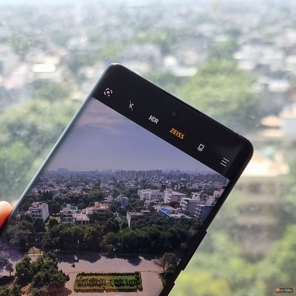
Vivo’s X-series of phones pride themselves on their video-recording adroitness too. In fact, the X70 Pro+ ships with a dedicated gimbal sensor which kicks in whenever you toggle the phone’s built-in stabilisation features. To that note, the smartphone offers three different stabilisation utilities namely Standard, Super or Ultra and Horizontal Line. Now, depending on which stabilisation features you use, the smartphone will automatically switch between the gimbal camera and the GN1 sensor. For instance, if you’re using the Super / Ultra stabilisation feature, then the device will shoot clips via the GN1 sensor. However, if you switch to Super Pro stabilisation, then the phone will revert to the gimbal camera. Furthermore, with all the stabilisation features turned off, the ultrawide videos (at 0.6x) will make use of the gimbal camera, whereas the ones shot at 1x will use the GN1 sensor. Do note that the X70 Pro Plus can not only shoot clips at 8K resolution, but it can even shoot ultra-wide angle videos at 4K 60fps.
Techno mumbo-jumbo aside, are the videos shot from the phone any good? In a word – yes. I spent a good chunk of time shooting snippets with the phone and while I primarily shot clips in 1080p resolution, the footage was downright fantastic – the clips had adequate sharpness and exhibited excellent dynamic range, ensuring the sky in the shots was never overexposed at the expense of bringing out the details from the shadows.
While most modern smartphones can achieve similar results, the stabilisation features on the X70 Pro+ set it apart from the herd of other devices. Simply put, the handset’s stabilisation features are second to none and the device allowed me to pan left and right and move my hand freely without introducing noticeable jitters in the frame. The sensors would rarely hunt for focus too and rest assured, the X70 Pro+ is easily in the upper echelon of camera-centric phones in India.
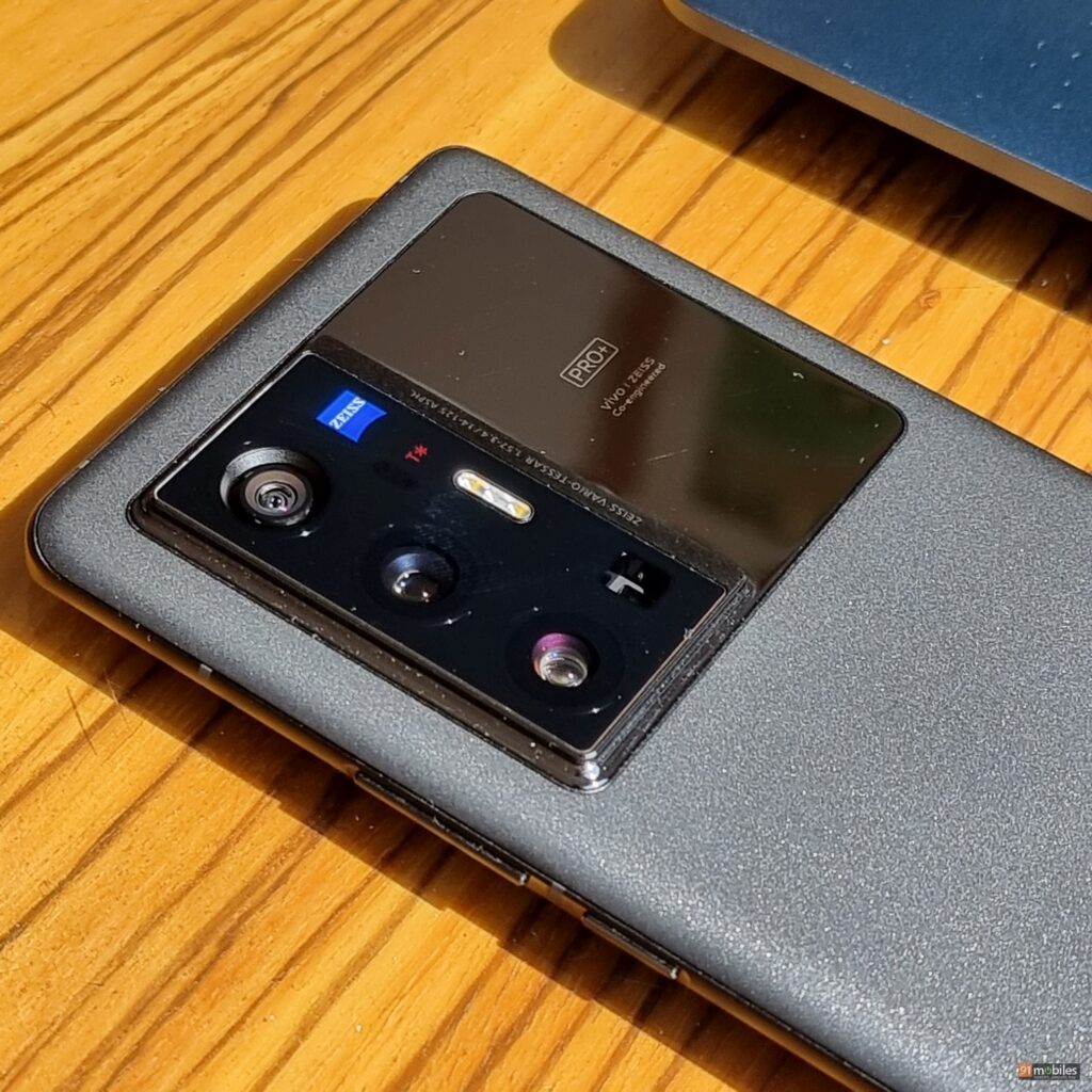
Now, it goes without saying that this isn’t an in-depth camera comparison between Vivo’s latest and the competition. However, I hope you now have a better understanding of the smartphone’s camera prowess.
Performance and Software
The Vivo X70 Pro+ is the first phone in the country to ship with Qualcomm’s Snapdragon 888+ processor. The SoC in question turbos higher and can achieve clock speeds of up to 3GHz as opposed to the 2.84GHz cap on the Snapdragon 888 platform. What’s more, the company has also bundled speedy LPDDR5 memory and rapid UFS 3.1 storage with the device, thereby future-proofing the smartphone’s performance chops.
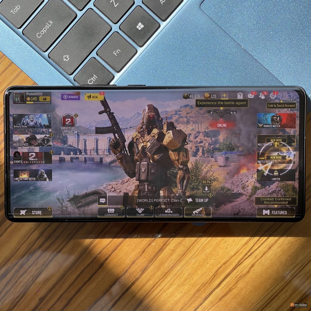
It goes without saying that the Vivo X70 Pro+ performs like a true-blue flagship. That said, the smartphone’s computing prowess isn’t leagues ahead of competing SD888-based flagships. The same is evident when you run synthetic benchmarks on the set and in Antutu, the device net a compelling score north of 8 lakh points. However, you could achieve the same numbers on say, the ROG Phone 5 as well. That’s not a dig at the X70 Pro Plus’ performance, mind you. However, buyers expecting a stark jump in performance should keep their expectations in check.
Coming back to the matter at hand, the X70 Pro+ scores big in the performance department and you can max out pretty much every single game on the Play Store on the phone. For instance, I could run CoD Mobile and BGMI at the highest graphics and frame rate presets and despite playing the games for around an hour at stretch, the X70 Pro+ didn’t drop any frames. In fairness, the temperature around the metal rails did spike, but the handset’s performance didn’t throttle. The same was evident in the CPU throttling test too wherein, the X70 Pro+ throttled to just 82 percent of its peak performance.
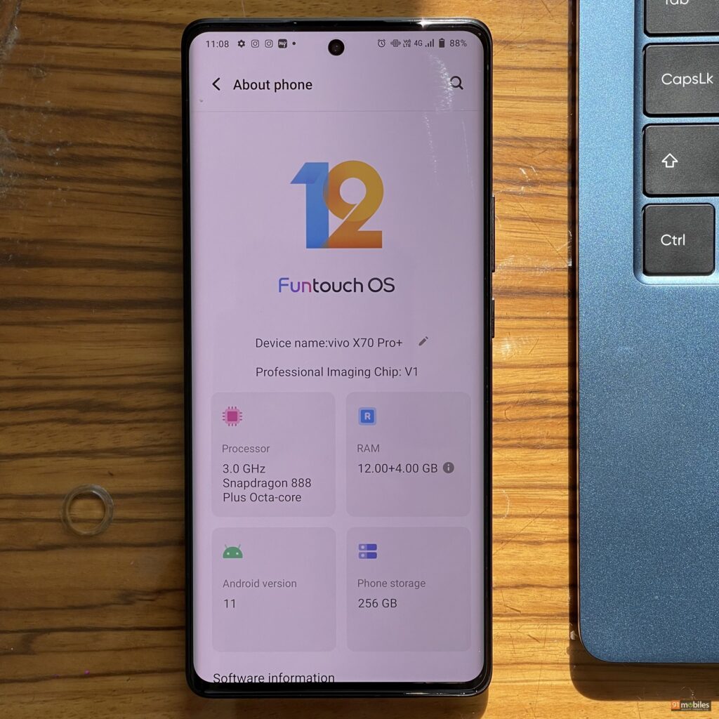
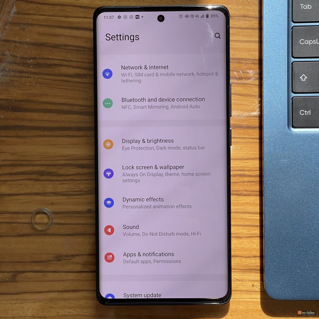
Understandably, a phone’s software plays a crucial role in delivering smooth performance too. To that note, the X70 Pro Plus’ near-stock, FunTouch UI skin didn’t bog my usage down. Disappointingly enough, the custom skin ships with a ton of bloatware, although users can uninstall most, if not all of the pre-installed apps from the phone. Moreover, the UI doesn’t ship with a ton of customisation features either. I do hope the upcoming Android 12 update breathes new life into the interface.
Battery Life and Connectivity
The X70 Pro+ ships with a high-performance chip and a gorgeous 2K display that refreshes at 120hz. Naturally, I didn’t make anything of the smartphone’s 4,500mAh cell. To my surprise, the device comfortably saw me through the end of a heavy workday with the display settings maxed out. Now, bear in mind that the battery dipped much quicker when I played games on the phone too. But, even then, I could top up the device quickly thanks to its 50W fast-charging tech. In fact, a full charge took me just a little over an hour, which is great.
Final Verdict
I won’t beat around the bush at all – the X70 Pro+ is a fantastic Android phone. For long, we’ve seen OEMs try their darndest to compete against the latest Galaxy phone or Apple iPhone and with the X70 Pro+, I feel that Vivo has honestly bridged the gap. The handset isn’t perfect and I would’ve liked to see tighter haptics, along with a more ergonomic display. However, the X70 Pro+ does more than enough to justify its price. So, if you were on the lookout for a top-notch Android phone, you should definitely consider the X70 Pro+.
Editor’s rating : 4 / 5
Pros:
- Stunning display
- Fantastic cameras
- Excellent performance
- Good battery backup
Cons:
- Mushy haptics
- Palm rejection isn’t the best
- Bulky
 Vivo X70 Pro Plus Vivo X70 Pro Plus |
vs |  Xiaomi Mi 11 Ultra Xiaomi Mi 11 Ultra |
 Vivo X70 Pro Plus Vivo X70 Pro Plus |
vs |  Apple iPhone 12 Pro Apple iPhone 12 Pro |
The post Vivo X70 Pro+ review: a well-oiled machine first appeared on 91mobiles.com.
https://ift.tt/3AUFeIr
https://ift.tt/3m4L1VC


No comments